


CONCEPT 2


For the first concept I want to build on the idea of you providing a 'curation' type of service and the concept of curation as a form of taking in and providing voice to a large variety of backgrounds, styles and narratives etc. This idea plays on the concept of change and eclectic visual nature in order to communicate the idea that you curate these narratives and creatives without forcing them into your cold so that they are unique to each other. The logo for this idea is a shield/crest, which has been modernised in a box. This concept will showcase a number of variations of 'ABNB' in a range of styles - this will lend to the prior mentioned idea of amplifying voices and creating diversity without forcing the shows and creatives into a box. The idea of the shield/crest logo is also a subtle nod to your Italian background (crests are common in heritage Italian design) as well as Fremantle (again, the idea of heritage): it also symbolises trust communicating that you have the best of intentions with creatives and their visions. The symbol also looks like a tooth which again is a subtle nod.
Across both concepts I've opted for a somewhat grungy and contemporary look to set you apart from competitors as speak to your own personal style.
ALL BITE NO BARK CURATION
CONCEPT 1
Curator & Theatre Producer
2026
Branding / Identity
Art Direction
[cc:]
This is an alternate version of the type formatted logo if the prior is too contemporary or clean. We can either use solely this or do a mix and match with both again playing with the idea of being eclectic and changing visually.

Walyalup / Fremantle, 6160
© 2025 SEAN. [cc:] 'C' Cameron
ALL RIGHTS RESERVED

INNOVATION FOR THE NICHE
Perth, WA AUS
info@seancc.design


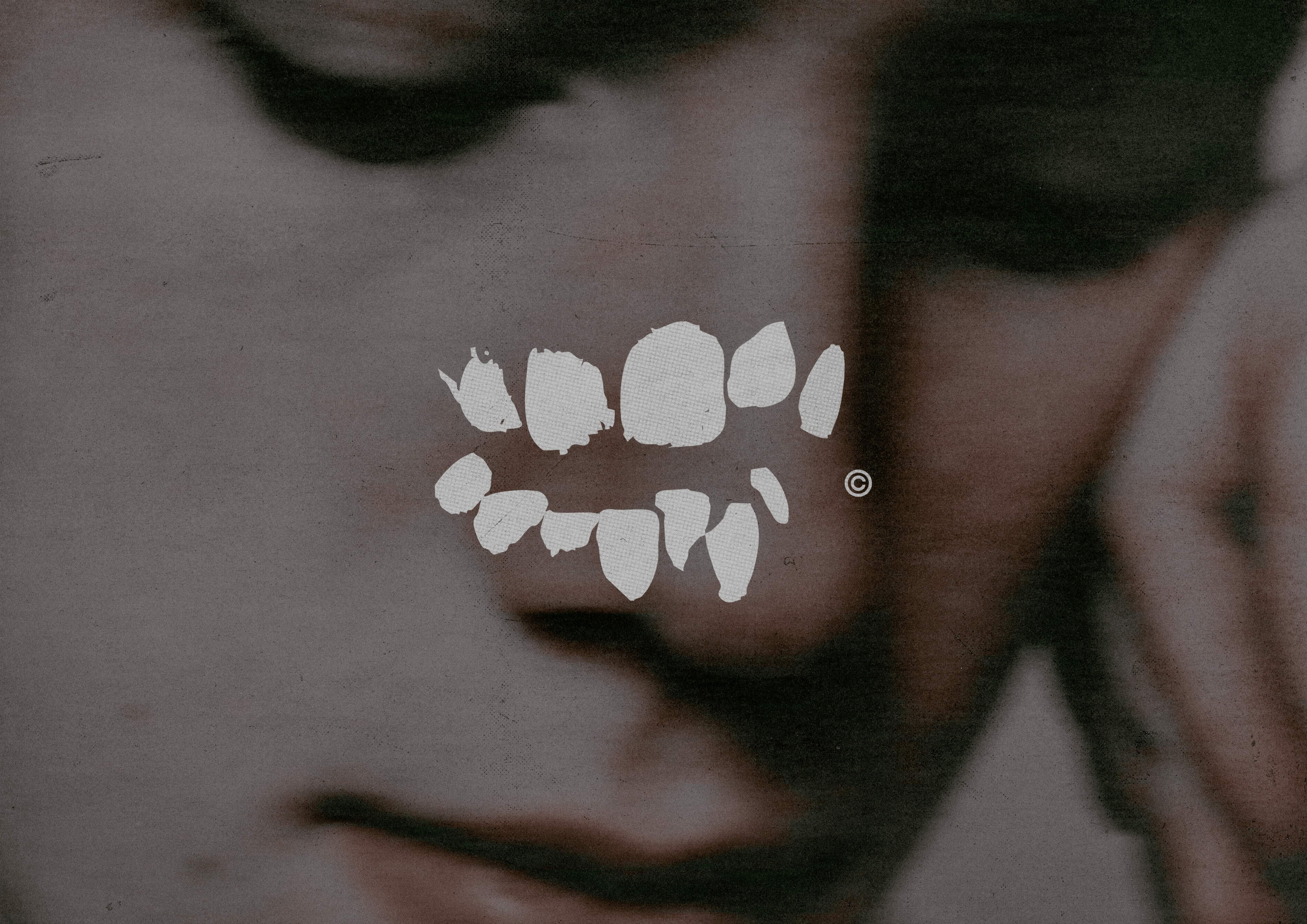
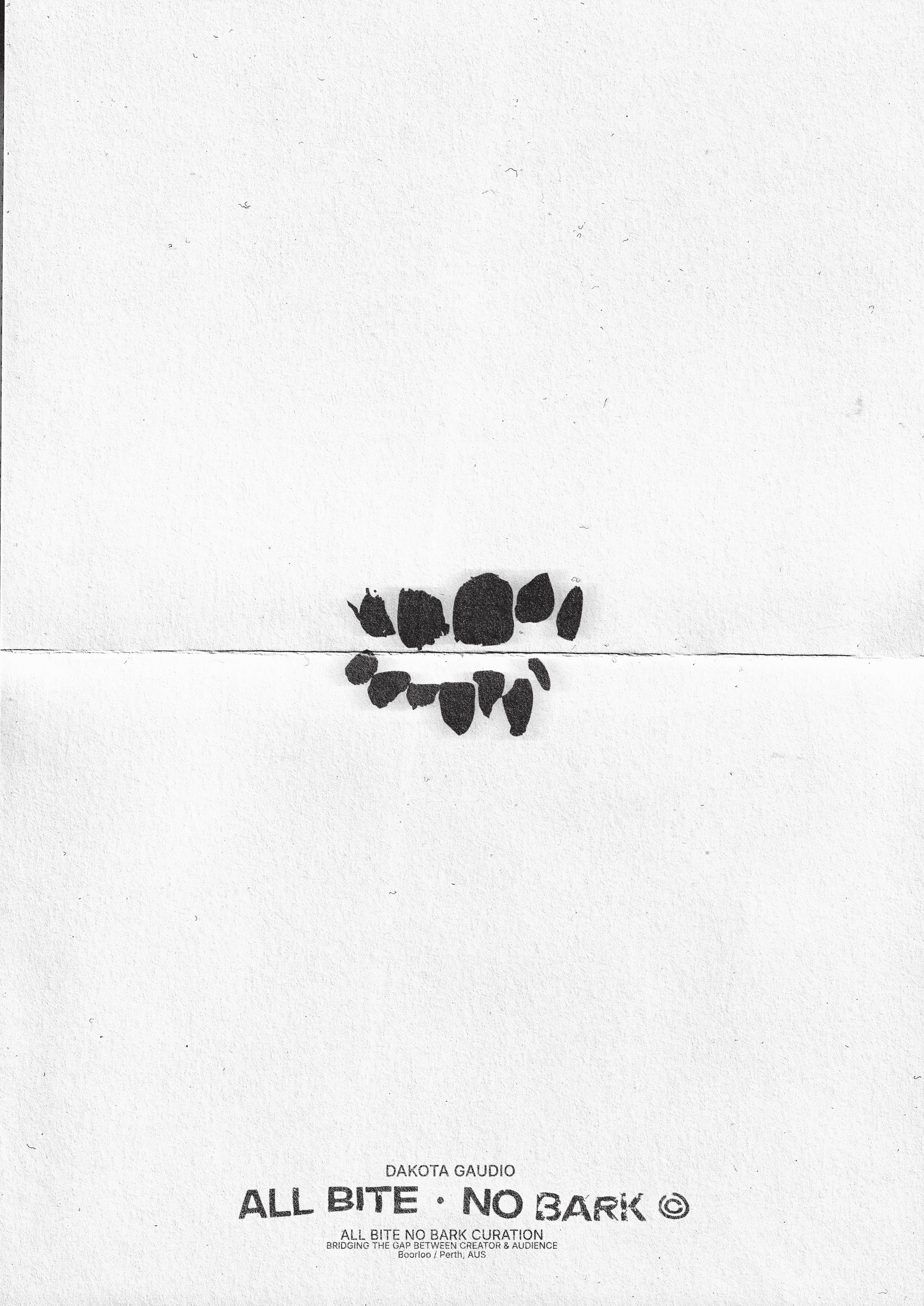
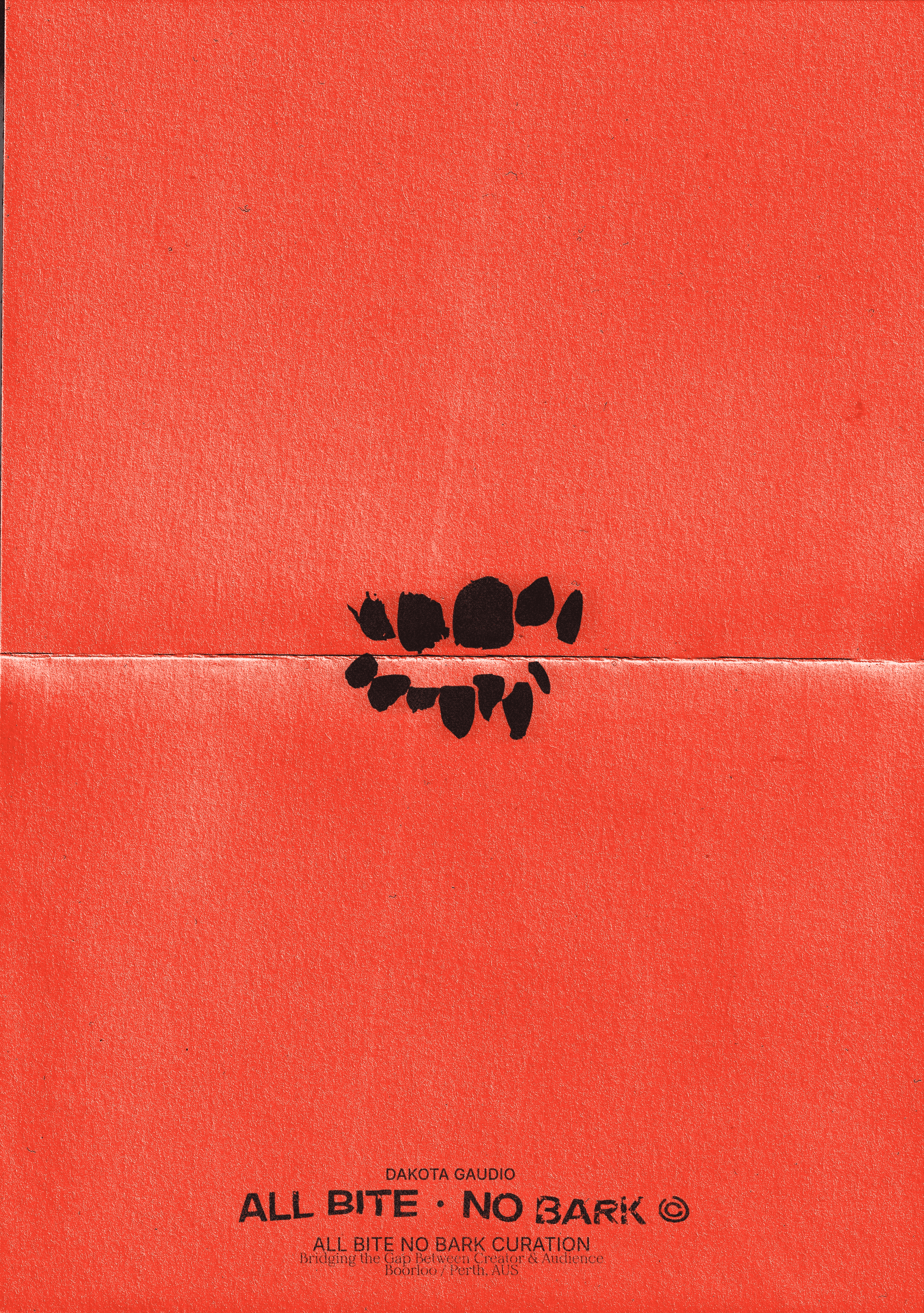
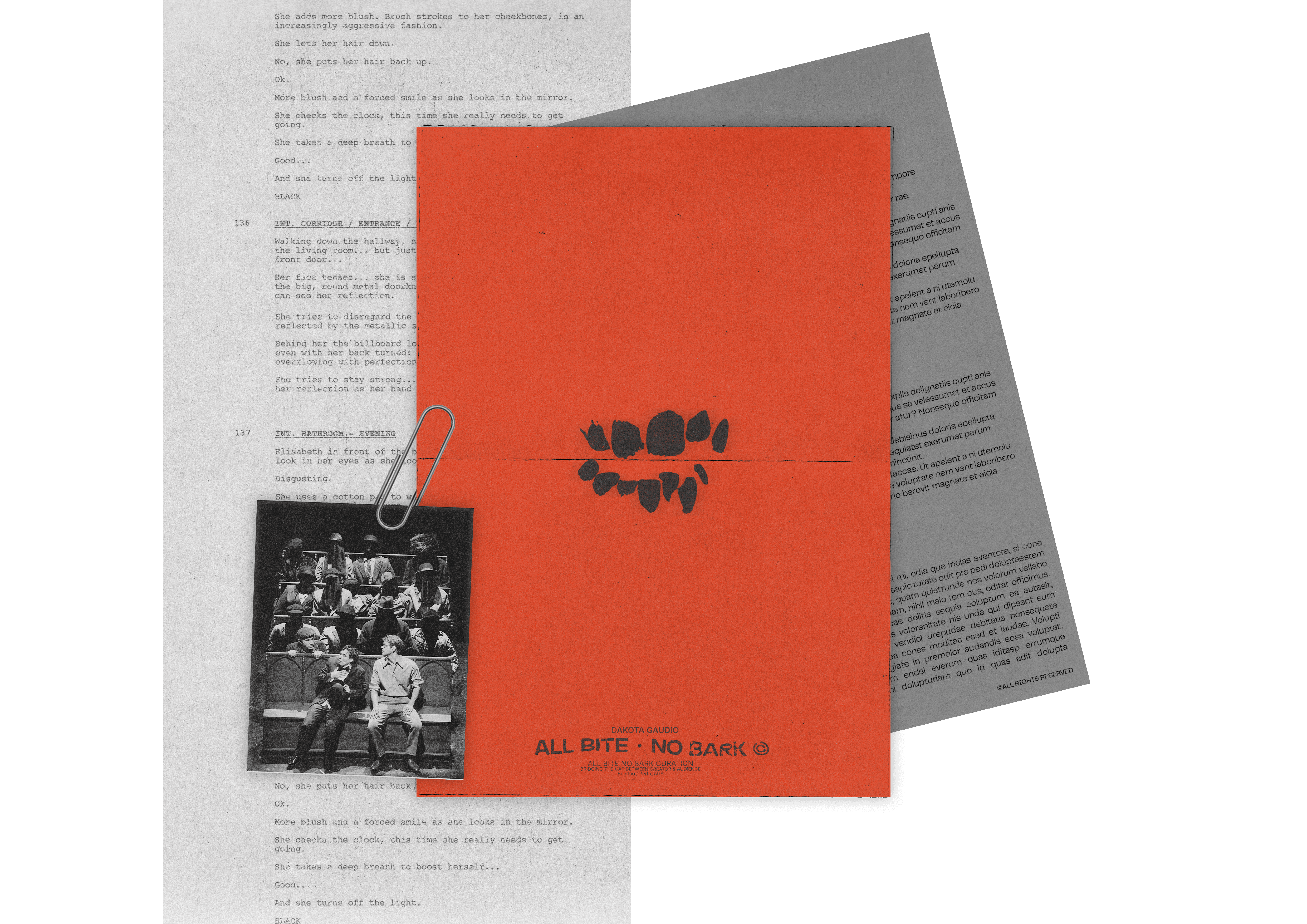
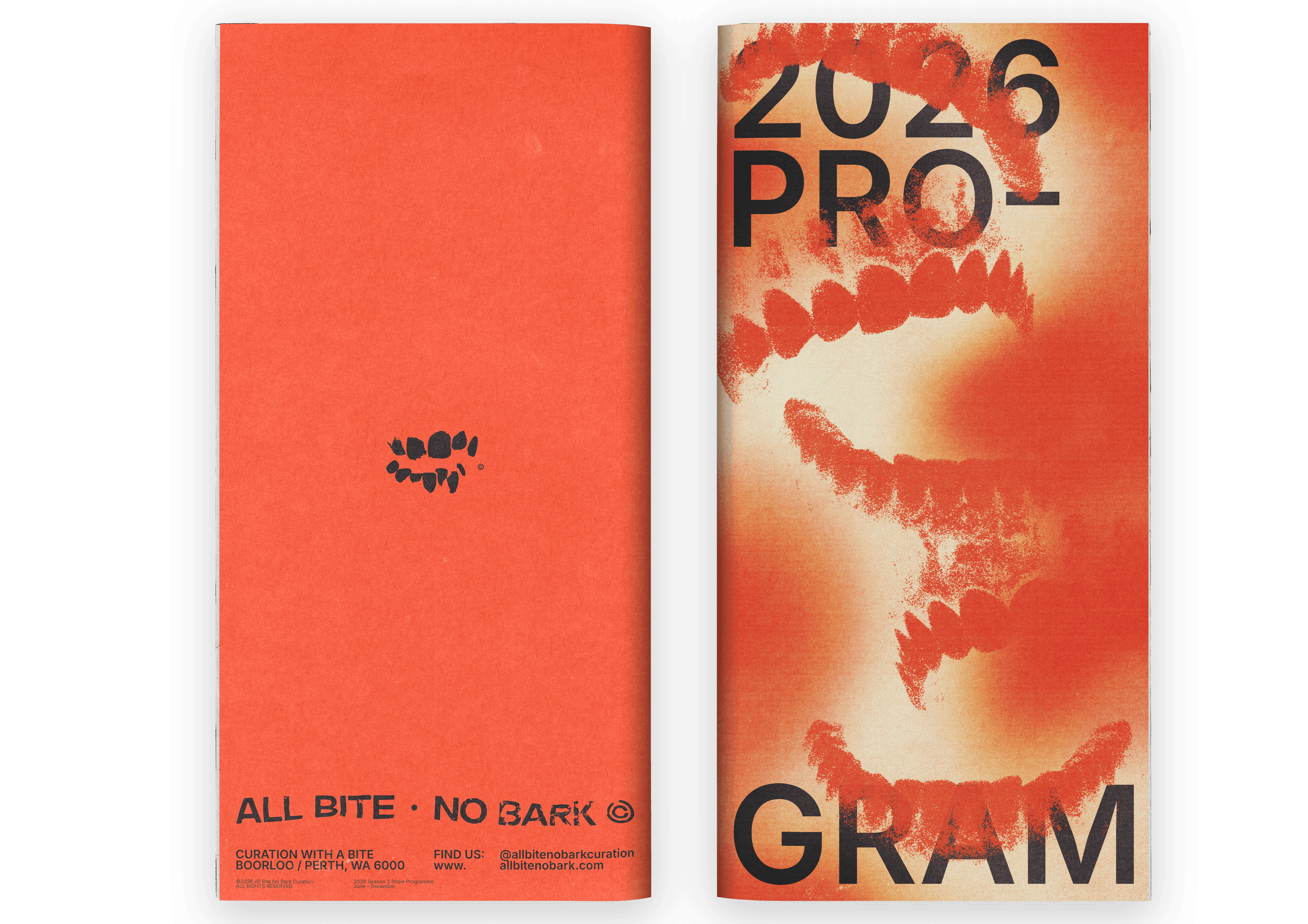
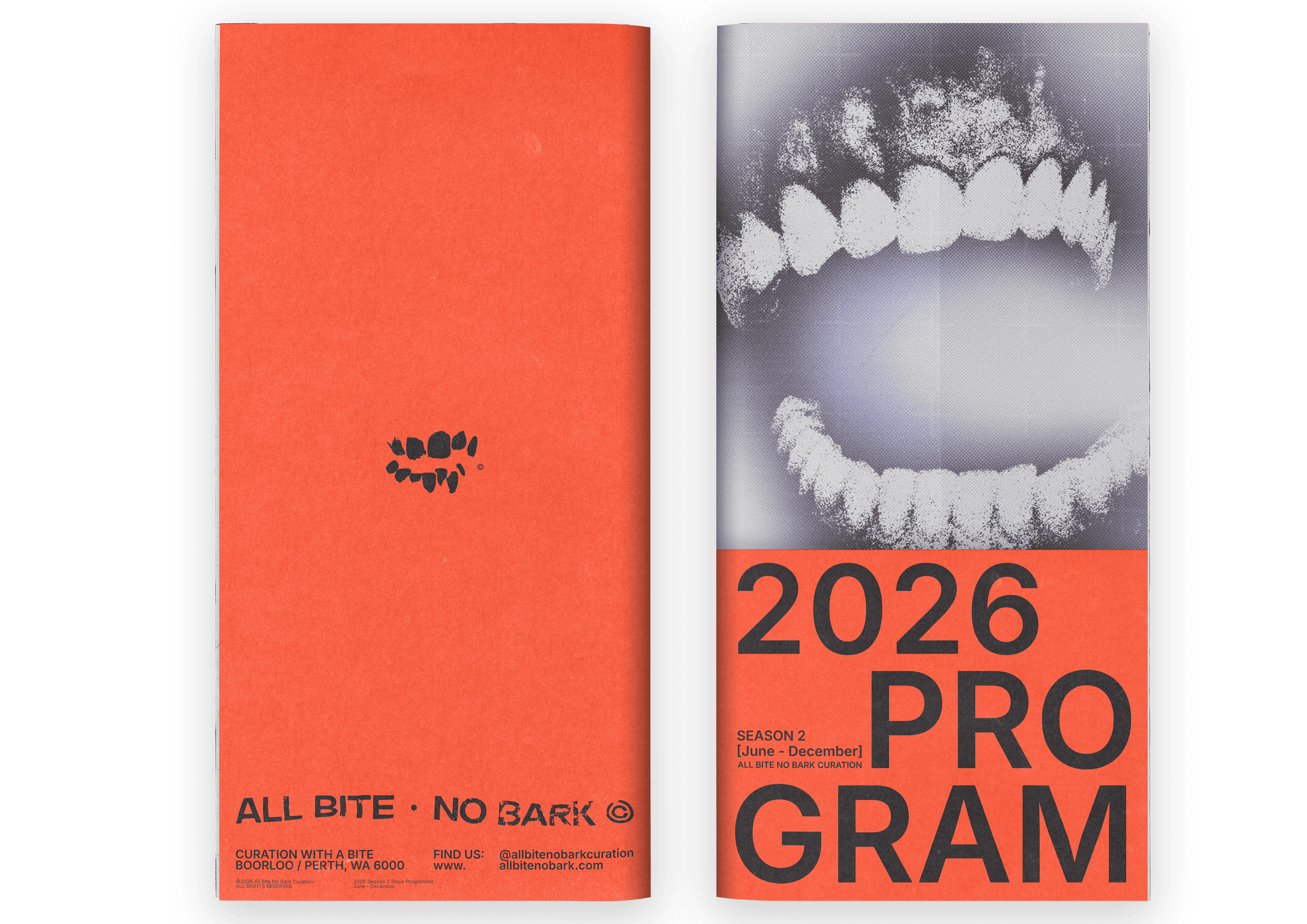
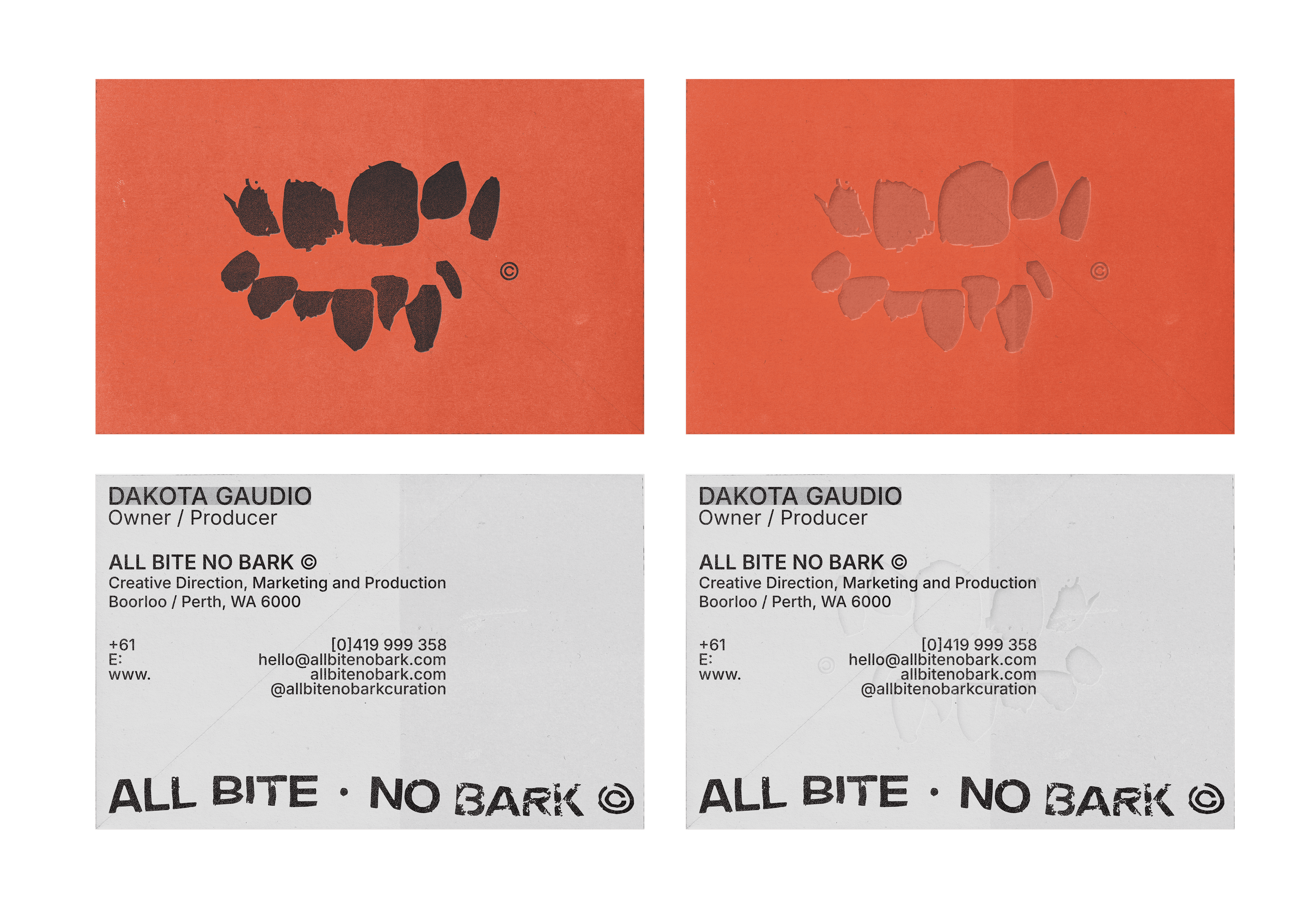
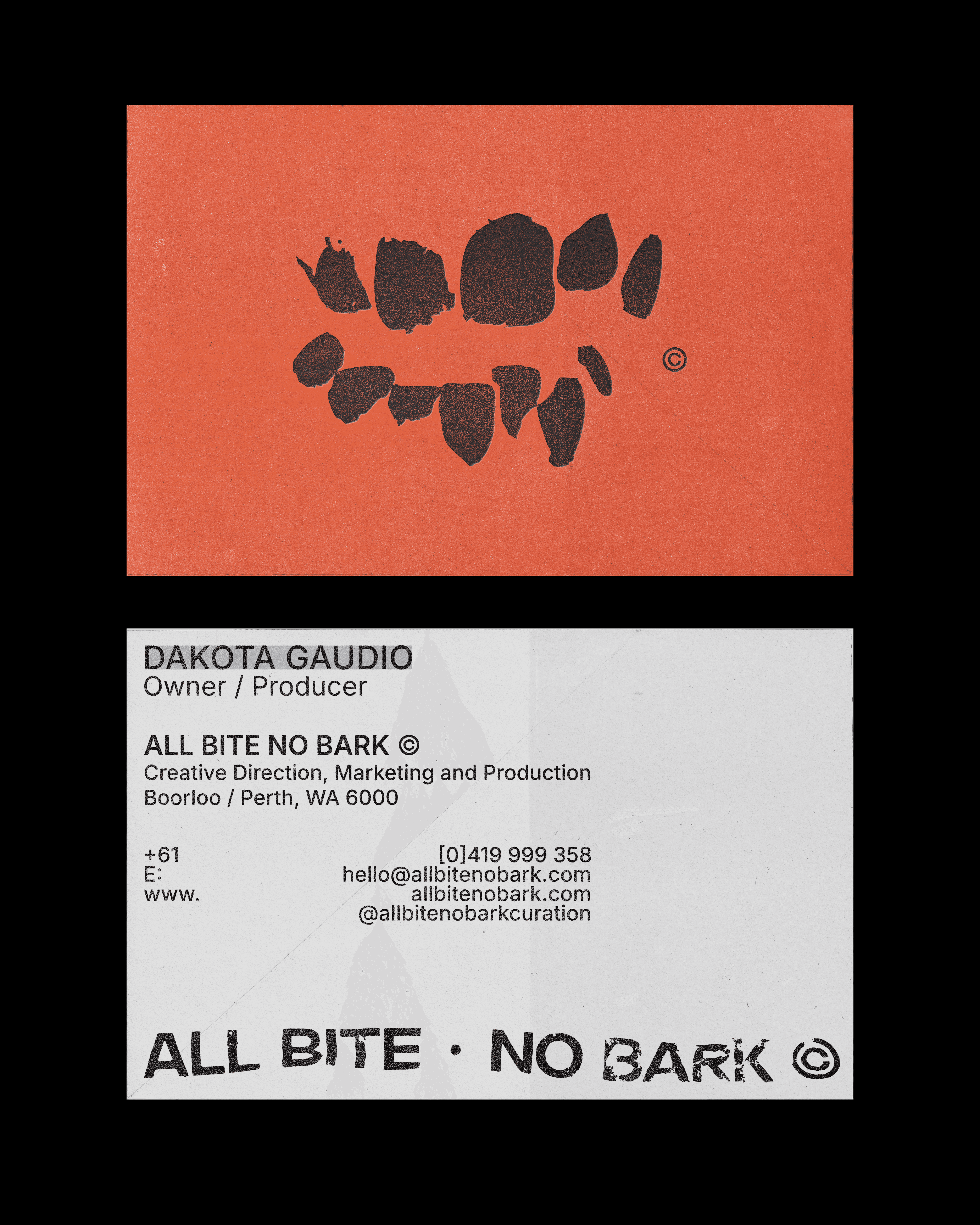
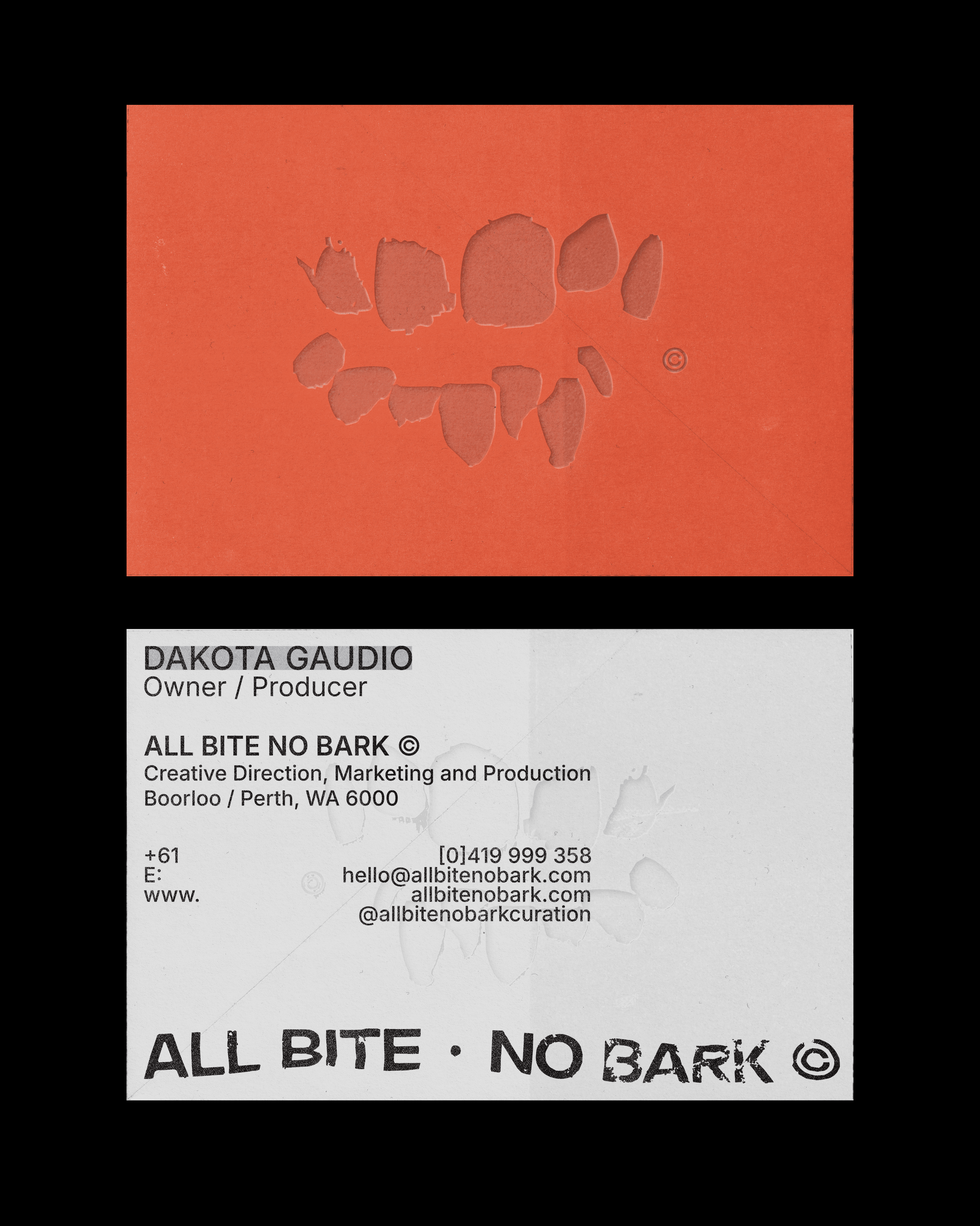
This concept moves away from the more conceptual narrative of the first concept and instead plays on the idea of your brand as this edgy, creative led curator. Playing on the idea of biting, a lot of this concept focuses on louder, grungier stylings.
The type is distorted as though it has been bitten but still stays really clean, professional and readable. The primary logo mark is a distorted set of teeth again linking to this idea.
CONCEPT 2
Curator & Theatre Producer
2026
ALL BITE NO BARK CURATION
CONCEPT 1
For the first concept I want to build on the idea of you providing a 'curation' type of service and the concept of curation as a form of taking in and providing voice to a large variety of backgrounds, styles and narratives etc. This idea plays on the concept of change and eclectic visual nature in order to communicate the idea that you curate these narratives and creatives without forcing them into your cold so that they are unique to each other. The logo for this idea is a shield/crest, which has been modernised in a box. This concept will showcase a number of variations of 'ABNB' in a range of styles - this will lend to the prior mentioned idea of amplifying voices and creating diversity without forcing the shows and creatives into a box. The idea of the shield/crest logo is also a subtle nod to your Italian background (crests are common in heritage Italian design) as well as Fremantle (again, the idea of heritage): it also symbolises trust communicating that you have the best of intentions with creatives and their visions. The symbol also looks like a tooth which again is a subtle nod.
Across both concepts I've opted for a somewhat grungy and contemporary look to set you apart from competitors as speak to your own personal style.
This is an alternate version of the type formatted logo if the prior is too contemporary or clean. We can either use solely this or do a mix and match with both again playing with the idea of being eclectic and changing visually.
This concept moves away from the more conceptual narrative of the first concept and instead plays on the idea of your brand as this edgy, creative led curator. Playing on the idea of biting, a lot of this concept focuses on louder, grungier stylings.
The type is distorted as though it has been bitten but still stays really clean, professional and readable. The primary logo mark is a distorted set of teeth again linking to this idea.
Walyalup / Fremantle, 6160
© 2025 SEAN. [cc:] 'C' Cameron
ALL RIGHTS RESERVED
INNOVATION FOR THE NICHE
Perth, WA AUS
info@seancc.design
STAGE 1 DEVELOPMENT
STAGE 1
DEVELOPMENT